|
|
|
|
|
Each tab represents a single group of view elements. The more tabs you specify here in the View Designer, the more tabs there will be on the View. The selected view elements from the 'Attribute resource section' will be added to the currently selected tab.
Note: The individual 'tabs' can behave like sections in the web client. Please see the 'Sections' topic for details.
To create a new tab:
- Click the '+' empty tab.
The Input dialog box appears.
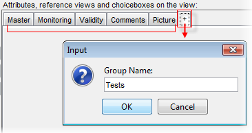
- Enter a name of the new tab.
- Click 'OK' to proceed.
Note: To rearrange the order of the groups with respect to each other, simply drag and drop the selected group into a new position.
If you click directly on the tab header, the additional options for the tab appears below in the Properties tab:
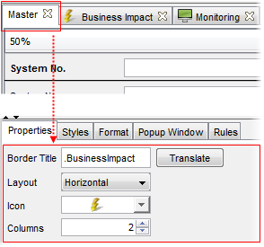
- Border title
Here you can write a border title for the tab.
Click 'Translate' to go to the translation editor to make the label translation if desired.
It is possible to specify translations for view tab names. Each tab name can be provided with two translations (USU standard translation and customer specific translation) in each of the supported languages. See the 'Translations in Valuemation' chapter for more on Valuemation translations.
To specify translations for a view tab:
- Select the 'Translate' button. The 'Translations of Application Text' catalog filtered to display only the translation keys for the currently selected tab gets opened. Note that each supported language has its own translation key.
- In the catalog, double-click the translation key you want to provide translations for.
The key gets opened in the 'Translation Editor' where the translations can be edited or created.
- Layout
You can set the mutual label and value orientation. It specifies whether field labels are displayed alongside the corresponding field (horizontal) or directly above (vertical). Only the horizontal and vertical layouts are available. The default value is 'Horizontal'.
The settings take effect immediately in the View Designer.
Note: Each tab has an independent layout setting.
- Icon
Select one of the predefined icons. The icon appears next to the tab label.
- Columns
Enables you to specify the number of columns in the View Designer. Note that the row span in the designer changes with the column width. A narrow design with more columns may be limiting for some types of attributes or their specific properties.
The settings take effect immediately in the View Designer.
Note: Each tab has an independent column setting.
To remove a tab:
- Click the small cross on the selected tab.
The Confirmation dialog box appears.
- Click 'Yes' to delete the tab.
Note the the tab will be deleted together with all view elements.