|
|
|
|
|
In the View Designer, you can group several view elements together. Using the grouping functionality, you can visually separate the selected elements in the view. The grouped elements will be framed by a simple border.
When created, you can work with a group as with any other single view element: Drag and drop it into another position, change its row and column span or remove it completely using the 'Remove' button. Similarly, you can also manage all of the individual elements inside the group.
Grouping is managed by the Group control buttons in the Group Layout tab.
To create a group:
- Select at least two view elements in the View Designer.
Only a continuous rectangular selection is possible. It means that you can select the elements next to each other or on top of each other but not two or more elements across several rows or columns.
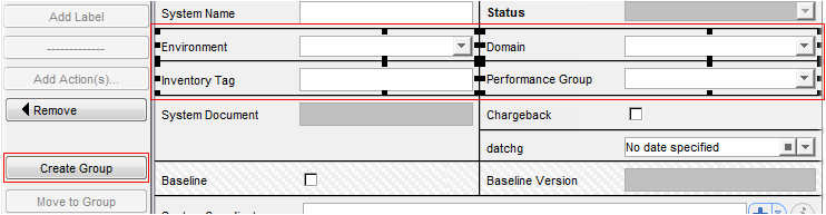
- Click 'Create Group'.
A new group is created.
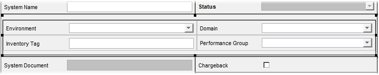
If you click the group header, the following Group properties appear below on the 'Properties' tab:
- Show Border
Select the check box if you want the frame around the group to be visible.
- Border Title
Add a border title to the group.
- Border Thickness
Here you can define the thickness of the group's border.
- Border Color
Pick the border color.
On the rich client, the default color is black. On the web client, the default color is related to the applied skin.
- Background Color
Pick the background color.
On the rich client, the default color is black. On the web client, the default color is related to the applied skin.
- Icon
Choose an appropriate icon for the group. The icon will be placed next to the border title.
- Columns
Enables you to specify the number of columns within the group.
This setting is valid just for the inner layout of the particular group and it is independent of the general column setting defined in the Group Properties.
Note: If you click on a group for the first time, the whole group is selected and the properties for the whole group are displayed below. If you click again on an element inside the group, now only the properties for the inner element are shown below.
If you right-click a group, the context menu with the following options appears:
- Insert row
Inserts an empty row in the group.
- Insert column
Inserts a new column in the group.
- Remove
Removes the group with all its inner view elements.
- Cut
Cuts the group of view elements from the current group (tab) to let you paste it into another group (tab)
Note: You cannot use the cut-paste action in the same group (tab). The copy-paste action is not allowed because no attribute can be used twice in the view.
To add a new view element into a group:
- Select an existing group.
- Add a new view element using the control buttons.
The element will be added into the selected group.
To move a view element into a group:
- Select one or more view elements in the view designer.
- Select the required group.
- Click the 'Move to Group' button.
The selected view element(s) will be moved into the selected group.
Note: You can also move the action toolbar to the group.
To remove a view element from a group:
- Select one or more view elements in the group.
- Click the 'Remove from Group' button.
The selected view element(s) will be removed from the selected group and placed at the bottom of the view designer.
Note: It is not possible to move individual view elements between groups. If you want to do so, first you must remove the selected element from the first group and move it into the second group.