|
|
|
|
|
Columns Tab
The Columns Tab determines which attributes of the business object selected on the General Tab will be available as columns in the catalog. The order of columns, sorting and various column display properties are also specified here.
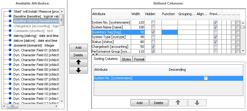
The Columns Tab of the Catalog Customizer
The Columns tab is divided into the following sections:
- Available Attributes
Lists business object attributes available to be displayed as columns in the catalog. Attributes already used are grayed out.
- Defined Columns
Lists catalog columns. Columns may be added, removed and rearranged using the 'Add / Delete /Move Up / Move Down' buttons. Column display properties may be edited directly in the list.
- Sorting Columns
Specifies the sorting in the catalog. Columns available in the Defined Columns list may be included to be used for sorting and sorting priority specified using the 'Add / Delete /Move Up / Move Down' buttons.
Important technical note:
For certain combinations of value sets and transient attributes, expected default sorting is not applied when a catalog is opened.
This is the case when sorting is used on a persistent attribute with an object value set applied to it. Object value sets have a 'save' attribute which is stored in the database and a 'show' attribute used for data display which is transient and calculated. When a catalog is loaded from the database, catalog records are sorted according to the 'save' attribute and thus appear unsorted to the user who considers the display values. Sorting manually (by clicking on the respective column header) remedies the situation as this sorting is performed in the memory.
The following column properties are available in the Defined Columns list:
- Attribute
Name of attribute.
- Width
Width of column.
- Hidden
Indicates that the attribute should be hidden. Hidden attributes can be displayed again by the user.
- Function
Specifies that a function should be applied to the column. For fields with numeric content, the functions Min, Max, Avg and Sum are available. The function is applied to the entire column and the result is displayed at the bottom of the catalog.
- Grouping Level
Specifies that the column should be included in the grouping. Enter the number of the level that this attribute should represent in the grouping. The numbers must be distinct with 1 representing the highest level of grouping. For more on Grouping see Grouping in Catalogs.
- Alignment
Specifies the alignment column content (left, center, right). Note that alignment options exhibit the following behaviour:
Right:
- If the content fits within the column width, it is right-aligned.
- If the content is longer than the column width, it is left-aligned and its right-hand end is truncated.
Center:
- If the content fits within the column width, it is centered.
- If the content is longer than the column width, it is left-aligned and its right-hand end is truncated.
- Preview
Enables you to select attributes which will be part of the 'Detail Viewer' preview.
The 'Detail Viewer' activation is done on the General Tab.
Please see also this section in Valuemation Essentials.
- Collection display type
Selects a display type for a collection attribute.
- A,B,A,A
Displays all items (values).
- A,B
Displays only unique items.
- A(3x),B
Displays only unique items/values with their quantity in parentheses.
- A,B,A,A
- Collection order
Specifies the sorting order of the collection.
- Mandatory
Specifies that the cells in this column are mandatory.
The attribute can be set as mandatory in three ways:
- On the business object type level.
- In the catalog customizer 'Columns Tab'.
- By a view rule applied in the catalog customizer 'General Tab'.
If an attribute is specified as mandatory on the business object type level, it is always mandatory and this cannot be changed in the 'Columns Tab' or by a view rule. If an attribute is specified as non-mandatory on the business object type level, it can be made mandatory in the 'Columns Tab' or by a view rule. Making an attribute mandatory or non-mandatory by a view rule overrides the setting made in the 'Columns Tab'.
- Editable
Specifies that the cells in this column can be edited - so called inplace editing. See 'Catalog inplace Editing' for more information.
Note: Time related data (TRL) are displayed in a catalog as a collection attribute. All of these are displayed, no matter how old they.
|
Basic Operations on the Columns Tab
The 'Available Attributes' list contains all attributes of the object type for which the catalog is being created and configured. Select the attribute which is to be displayed as one of the catalog columns and use the 'Add' button to include the attribute in the list of 'Defined Columns'. Multiple attributes can be selected at the same time. If an attribute in the 'Available Attributes' list is grayed out, it has already been used.
When adding an attribute to the list of defined columns, the following courses of action are possible: Select a column in the 'Defined Columns' list, then select an attribute in the 'Available Attributes' list and press 'Add'. Multiple attributes can be selected at the same time. In this case, the new column will be placed right after the selected one. Additionally, this newly inserted column will become the selected column, thus making it possible to insert columns sequentially one after another with minimum clicking. If no column is selected in the 'Defined Columns' list, then new columns are inserted at the end of the list.
You can also use the 'Move Up' / 'Move Down' buttons in the 'Defined Columns' list to edit the order of catalog columns. Multiple attributes can be selected at the same time. Use the fields in the 'Defined Columns' list to specify column display properties as desired (see above for more details on column properties).
In the 'Sorting Columns' section, use the 'Add' button to add a column present in the 'Defined Columns' list to the 'Sorting Columns' list. Multiple attributes can be selected at the same time. This causes the catalog to be sorted by this column. If descending direction is required, set the column's 'Descending' check box to TRUE. If more columns have been used for sorting, sorting priority is determined by their order in the 'Sorting Columns' list and may be changed using the 'Move Up' / 'Move Down' buttons in section. Multiple attributes can be selected at the same time.
Styles and Formats
You can define an individual style and format for particular attributes of the catalog. The format is applicable to numeric types, dates and timestamps only. It enables you to express the numeric, calendar or date entries in several ways which help to eliminate ambiguity. The style is applicable to any attribute of any type. Unlike the format, the style enables you to visually emphasize certain text elements using colors, bold and italics options or the font size.
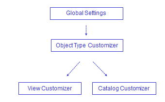
On this page, you can set the formatting on the level of catalogs (i.e. the lowest level with the highest priority) but the definitions can be also made globally in the Global Settings for all fields or lower on the level of Object type Customizer. In this case, the general (global) setting is always overridden by the more specific setting on the level of a Customizer.
The priority of settings goes as follows (in the ascending order):
Styles
On the Style tab, there are the following options:
|
Click the appropriate tab to select the style definition/modification. |
|
Add a new style. Several styles (usually limited by conditions) can be defined for an attribute. |
|
Select the required font size. |
|
Select the required technique of emphasis through the modification of the font. The Bold, Italics and Underline options are available. |
|
Calls a special 'Color' dialog box which enables you to select (and customize if required) the foreground color. The 'Color' dialog box also contains a live preview at the bottom. |
|
Calls a special 'Color' dialog box which enables you to select (and customize if required) the background color. The 'Color' dialog box also contains a live preview at the bottom. |
|
A mini-preview area shows the selected combinations of the foreground and background colors. |
|
Removes the selected style. |
|
Create/edit the condition under which the style would be applied. Clicking the button calls the 'Edit Query' dialog box where a condition (for the already predefined style) can be defined. After the condition is defined, you can see it in the window as an inherent part of the style definition. Note: If several conditions are applied, they shoud be disjunctive! |
|
|
Please see also an example in the Object type customizer which demonstrates a typical style use.
Formats
It is also possible to define a format depending on an attribute type. It means that different types of certain attributes (typically numbers and dates, such as Number, BigDecimal, Integer, Timestamp etc.) can be individually formatted. For instance, you can define that all numbers would be given two decimal places or that all numbers would not have a thousand separator or that all dates would have mm/dd/yyyy format only.
On the Format tab, there are the following options:
- Pattern
You can define your own pattern using specific pattern symbols: Start with selecting a predefined format, switch to the 'Pattern' radio button and edit/modify the format as needed. Watch the example field which reflects the modified pattern. If the pattern is illegal, it will not be stored.
Note that unlike the predefined format, for dates and times the pattern is fixed and does not reflect the language itself (e.g. dd.MM.yy will always show first the day, then month, then year, separated by . in any language).
Explanation of the pattern symbols (Number):
|
# |
Digit (shown only if present). |
|
0 |
Digit (the zero = absent). |
|
. |
Decimal separator used for the mask definition (as seen by the consultant). The separator symbol used in the resulting formatted value (i.e. seen by the end user) depends on the selected GUI language. For example, a decimal point will be used in English and a comma in German. |
|
, |
Grouping separator used for the mask definition (as seen by the consultant). Again the symbol used in the resulting formatted value depends on the selected GUI language. For example, a comma will be used in English and a dot in German. |
|
; |
Separates the positive and negative subpatterns. |
|
- |
Minus sign. |
|
% |
Multiply by 100 and show as percentage. |
|
¤ |
Base currency symbol. If doubled, replaced by international currency symbol (the actual symbol varies with the locale - e.g. $ in US). |
|
E |
Separates the mantissa and exponent in a scientific notation. |
|
' |
Used to quote special characters in a prefix or suffix, for example, "'#'#" formats 123 to "#123". To create a single quote itself, use two in a row: "# o''clock". |
|
|
|
|
Explanation of the pattern symbols (Date): |
|
|
G |
Era designator, e.g. AD |
|
y |
Year; e.g. 1996; 96 |
|
m |
Month in year, e.g. July; Jul; 07 |
|
w |
Week in year, e.g. 27 |
|
W |
Week in month, e.g. 2 |
|
D |
Day in year, e.g. 189 |
|
d |
Day in month, e.g. 10 |
|
F |
Day of week in month; e.g. 2 |
|
E |
Day in week,e.g. Tuesday; Tue |
|
a |
Am/pm marker, e.g. PM |
|
H |
Hour in day (0-23), e.g. 0 |
|
k |
Hour in day (1-24), e.g. 24 |
|
K |
Hour in am/pm (0-12), e.g. 0 |
|
h |
Hour in am/pm (1-12), e.g. 12 |
|
m |
Minute in hour, e.g. 30 |
|
s |
Second in minute, e.g. 55 |
|
S |
Millisecond, e.g. 978 |
|
z |
Time zone, e.g. Pacific Standard Time; PST; GMT-08:00 |
|
Z |
Time zone, e.g. -0800 |
|
|
|
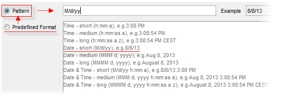
- Predefined Format
It is also possible to select one of the predefined formats so that you don't have to worry about the pattern symbols. The predefined formats reflect the current language (i.e. the pattern changes as you switch the language - e.g. M/d/yy is used for United States, but dd.MM.yy for Germany). You can modify the pattern as described above but the format will change (will be saved to) the fixed Pattern.
Column Properties
The Column Properties tab is intended for properties of the boolean attribute only.
The boolean attribute has the following properties:
- Check box type
There are three possible options:
- Two State - the check box uses only two values True/False (selected, clear)
- Three State - the check box may use three values True/False/null (selected, clear, grayed-unchecked)
- Not specified - backward compatible behavior
During the initialization, you can specify the behaviour of the check box when the null (empty) value is going to be set for them.
The behaviour is different for mandatory and non-mandatory check box fields:
Mandatory check box:
- Two State - displays False (unchecked) for the null value. When saved, it uses the False value (the value is modified).
- Three State - displays null (grayed-unchecked) for the null value. It cannot be saved until changed by a user. When the value is changed, the check box switches to Two State behavior (True/False only).
- Not specified - When neither 'Two State' nor 'Three State' is selected in the 'Properties' tab, the check box behaviour is backward compatible with older Valuemation versions (i.e. before three state check box was introduced). A mandatory check box behaves like the two state check box. It displays False (unchecked) for the null value. When saved, it uses the False value (the value is modified).
Non-mandatory check box:
- Two State - displays False (unchecked) for the null value. When saved, it uses the null value (the value is not modified).
- Three State - shows null (grayed-unchecked) for the null value. When saved, it uses the null value.
- Not specified (backward compatible) - behaves like the Three State check box. It shows null (grayed unchecked) for the null value. When saved, it uses the null value.
Transition states of check box values graphically:
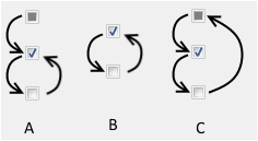
A) Mandatory check box with null attribute value.
A mandatory check box behaves as a two state check box. The exception is its initial state when no value has been set, in which the check box temporarily switches to the three state mode and its value is null. Once a value (True or False) has been set, the check box switches to the two state mode and the NULL value cannot be set any more.
B) Two state non-mandatory check box. Null is always displayed as false.
A non-mandatory two state check box with null value is displayed as 'False' but its internal value is null. Null is returned with the getValue() function.
C) Three state non-mandatory check box. Null is displayed as null (grayed-unchecked).