|
|
|
|
|
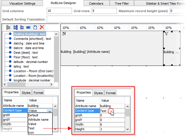
MultiLine Designer Tab
One of the ways in which data in a Valuemation catalog may be displayed is the MultiLine catalog mode, where several lines are devoted to each object in the table. The MultiLine Designer tab provides means to create and customize the MultiLine layout of a catalog.
The Multiline Designer tab of the Catalog Customizer
The following paragraph provides a brief description of the MultiLine Designer tab. For more information on using the Multiline Mode and a step-by-step example of creating a Multiline layout, please refer to the Multiline Catalog Mode topics.
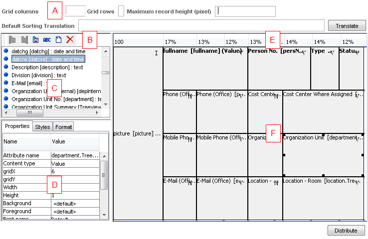
Section (A): The grid settings
- Grid Columns
Elements in the Layout Pane are placed in a virtual grid. 'Grid columns' specifies the number of grid columns.
- Grid Rows
Elements in the Layout Pane are placed in a virtual grid. 'Grid rows' specifies the number of grid rows.
- Maximum Record Height (pixel)
Enables you to set maximum height of the Multiline row (in pixels).
If a multiline cell contains an image, the cell height normally tries to accommodate the height of the image. 'Maximum Record Height' sets a limit on the entire multiline row which effectively limits the maximum height of its cells. If the height of an image in a cell is bigger that 'Maximum Record Height' minus the height of other cells in the row (vertically), then only part of the image is displayed. - Default Sorting Translation
If defined, it serves as the translation for the attributes in the 'Sorting Columns' section on the 'Columns' tab.
Example: You may want to define technical columns for the default column sorting in the Multiline catalog view mode. However, the technical columns shouldn't be available to a user in its "technical" form. Therefore, it is advisable to use the Translate button here on the Multiline tab to translate such columns.
Section (B): A toolbar for working with cells
- Remove / Add Cell
Click the button to remove/add cells from the layout pane. The cell currently selected in the layout pane (F) is deleted. The added cell is based on the attribute currently selected in the Object Type Attributes list (C). After you have added a cell, make sure to set its Content. Type as desired (most of the time you will want it to be set to 'Value'), see below.The new cell is added to the first empty location. left-right / up-down.
- Add Text Cell
Click this button to add a text cell. This can be used to quickly insert labels.
- Add Catalog Icon Cell, Add Catalog Icon Cell as Right/Left Column
Buttons add special types of cells to the grid. See below for explanation.
Section (C): Object Type Attributes
- Object Type Attributes
List of available attributes (based on the object type of the catalog). The Rich Text attributes can be used too.
Section (D): Cell properties, Styles and Formats
- Cell Properties
Properties of the cell currently selected in the Layout Pane.
For each cell it is possible to specify the following cell properties:
- Attribute Name
The object type attribute the cell is linked to
- Content Type
Cell type: 'Value' displays value of the linked attribute, 'Name' displays name of the linked attribute, 'Text' enables entering any text to be displayed in the cell (use the 'Attribute Name' field to do enter the text), 'Image' is used when the cell is intended to display an image (the cell is linked to an image attribute of the object type)
Please see paragraph 'Change of Content Type Restriction' below for important information.
- gridX
The horizontal position of the cell in the grid.
- gridY
The vertical position of the cell in the grid.
- Width
Width (in number of grid cells) of the cell.
- Height
Height (in number of grid cells) of the cell.
- Background
Background color (selected using a 'color picker' dialog box).
- Foreground
Font color (selected using a 'color picker' dialog)
- Font name
Type of font used in the cell ( Arial, Courier, Century etc.)
- Font size
Size of font used in the cell (Note: the biggest font size used in the cells of one row determines the height of the row.)
- Font style
Font style (Plain, Bold, Italic, Bold Italic)
- Alignment
Alignment of text within the cell (expressed in terms of major geographical directions)
- Using rendering conditions
Determines whether catalog rendering conditions should be applied also on the cell. See below for explanation.
- Multiline
'Text' and 'Value' content type only: If selected, then the text in the cell is line-wrapped. The cell's height is then determined by the amount of text in the cell. Note: The height of the tallest cell in the row determines the height of the entire row.
- Image height, Image width
'Image' or 'Icon' content type only: image height and width in pixels. See below for explanation.
- Attribute Name
- Styles, Formats
You can define an individual style and format for particular attributes as described on the Columns Tab.
Section (E): The Horizontal Proportion Bar
- The Horizontal Proportion Bar
Using this bar, mutual horizontal proportions of the layout grid can be precisely specified. See 'MultiLine Mode Customization' for more information.
Section (F): Layout Pane
- Layout Pane
This is where the actual layout is created. Cells can be added and deleted, placed and resized within the cell grid. When a cell is selected here (by clicking on it), its properties are displayed and can be edited on the Cell Properties tab (D).
Use of Rendering Conditions in MultiLine
Rendering conditions allow for selective differentiation of some catalog lines according to defined conditions. In the Multiline design, rendering conditions can be applied to individual cells. The rendering condition itself is inherited from settings defined on the Rendering Conditions tab.
If you want a Multiline cell to use catalog rendering conditions, check the Using rendering conditions flag in the Object Type Attributes / Cell Properties pane of the MultiLine Designer tab.
Add Catalog Icon Cell, Add Catalog Icon Cell as Right/Left Column
Add Catalog Icon Cell
Button adds a cell with catalog icon to the grid.
- If the Using rendering conditions flag is checked, then catalog icon is the icon defined by catalog rendering conditions.
- If the Using rendering conditions flag is not checked, then catalog icon is the standard icon used by the object type (Choose Icon button in the Object Type tab of ObjectType customizer).
Add Catalog Icon Cell as Right/Left Column
The buttons add a pre-customized cell to the leftmost / rightmost column of the Multiline layout:
- Cell height spans all rows of the grid
- The cell uses rendering conditions by default (it is possible to switch rendering conditions off)
- The cell displays the catalog icon as explained in 'Add Catalog Icon Cell' above
Intended use/hint:
The Add Catalog Icon Cell as Right/Left button can be used to quickly create a "signal" cell at the beginning/end of the Multiline.
When a line in a catalog is selected, its background color changes. This selection color change is overridden by rendering condition background color. In the Multiline design, the leftmost / rightmost column could be used as a "signal" cell using rendering conditions while the rest of the Multiline row has rendering conditions disabled. This way the row will always be distinguished from others according to catalog rendering conditions but the catalog selection background change will also be preserved.
Image height, image width
The Image height and Image width properties are relevant for 'Image' and 'Icon' Content type.
Ideal use of these properties is to specify the width of the column (in which the cell containing the image is inserted) in pixels (as opposed to percentage width) and also specify the Image height and image width properties for the cell. In this setting, image size will be proportionally changed and the image will fit the column width.
The height of Multiline rows is flexible (i.e. determined by row content, e.g. the amount of contained text). With image cells, the behaviour is as follows:
- If the height of the image cell is bigger than the height of the row(s) in which the cell is inserted, then image cell height determines the overall height of the row(s).
- If the height of the image cell is smaller than the height of the row(s) in which the cell is inserted, then the height of the row(s) behaves as usual (i.e. is determined by row(s) content).
If only one of the image cell dimensions is specified, then the image is not scaled and is inserted in the cell in its original size. In this case the image is cropped in horizontally (depending on the column width) and the height of the image determines the overall height of the row(s).
Content Type Change Restriction
Content type of a cell can be changed using the 'Content Type' field of cell Properties. Note, however, that once content type is changed to 'Text', the cell becomes a static text label and its connection to the underlying attribute is cut off. As a result it is not possible to change the content type back to other types. This problem can be solved by removing the cell and adding it again.