|
|
|
|
|
The Tab Properties
Click the tab header to see its properties below:
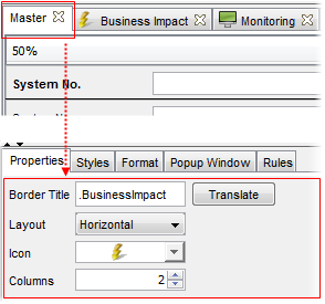
- Border title
Here you can write a border title for the tab.
Click 'Translate' to go to the translation editor to make the label translation if desired.
It is possible to specify translations for view tab names. Each tab name can be provided with two translations (USU standard translation and customer specific translation) in each of the supported languages. See the 'Translations in Valuemation' chapter for more on Valuemation translations.
To specify translations for a view tab:
- Select the 'Translate' button. The 'Translations of Application Text' catalog filtered to display only the translation keys for the currently selected group gets opened. Note that each supported language has its own translation key.
- In the catalog, double-click the translation key you want to provide translations for.
The key gets opened in the 'Translation Editor' where the translations can be edited or created.
- Layout
You can set the mutual label and value orientation. It specifies whether field labels are displayed alongside the corresponding field (horizontal) or directly above (vertical). Only the horizontal and vertical layouts are available. The default value is 'Horizontal'.
The settings take effect immediately in the View Designer.
Note: Each tab can has independent layout settings.
- Icon
Select one of the predefined icons. The icon appears next to the tab label.
- Columns
Enables you to specify the number of columns in the View Designer. Note that the row span in the designer changes with the column width. A narrow design with more columns may be limiting for some types of attributes or their specific properties.
The settings take effect immediately in the View Designer.
Note: Each tab has an independent column setting.
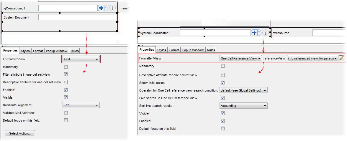
Formatter/View
The most important field in the Properties tab is the Formatter/View field at the top. Each attribute has a certain Formatter or View assigned by default when added to the view in the View Designer. The Formatters/Views available for a particular attribute depend on the attribute's attribute type as selected in the Object Type Customizer.
A Formatter is a control which formats the attribute in a specific way. A View is a small reference view used within the main view of a source object type to display data contained in the linked target object type. As there can be more reference views defined for the object type, you can pick a particular reference view from the list and select a specific format for the particular reference view.
Each of the Formatters/Views has different set of properties. The properties change dynamically as you switch among the individual Formatter/View types.
The following formatters are available:
For Text attributes:
- Text
Normal text field.
- TextArea
Larger text field, typically for use as comments or remarks.
- MaskText
Masked text field. This is used where the input should conform to a particular pattern (e.g. IP Address).
- Hyperlink
Hyperlink
- Label
Text label. Non-editable text field.
- Multiline Label
Text label which can contain several lines of text.
- HTML Viewer Control
The Rich Text editor. Not available in the Rich Client.
For text values with Value Sets:
- Choice Box
Displays a drop down combo box for selection.
- Radio Buttons
Displays each option as a radio button.
- List Control
Displays a scrollable list of options for selection.
- Label
Text label. Non-editable text field.
For Boolean attributes:
- Checkbox
Displays a checkbox. The behaviour of the checkbox can be further defined on the 'Properties' tab.
For Date and Date&Time fields:
- Date Calendar
Used for data of the Date attribute type. Similar to calendar controls used in other applications. Only date information may be entered using this control. Date format changes according to language settings.
- Date Time Calendar
Used for data of the Timestamp attribute type. Combined control allowing entry of both date and time information (Date by selection in a calendar, time by typing). Date format changes according to language settings.
- Date Infinity
Date Infinity.
- Timestamp
Date and time in the format of yyyy-mm-dd hh:mm:ss.000000. The format is fixed - independent on language settings.
- Timestamp Infinity
Timestamp Infinity.
- (Date) Text
Date as text.
- (Date) Label
Date as label.
- Time
The editor of time (field).
- Label
Text label. Non-editable text field.
For the relation attribute which represents a reference to a single object:
If you select a relation attribute for which a value set exist, the Formatter/View will be automatically set to 'Choice box'.
If no value set is available, the 'Reference View' reference view is used implicitly. If so, you can pick a particular reference view from the adjacent Reference View combo box and select a specific format for the reference view in the Formatter/View field.
There are three possible customizing options for the Reference View display:
- Extended Reference View
- One Cell Reference View
- One Line Reference View
See also the Reference View Display Options topic.
|
Formatter Properties
Each formatter has specific properties:
- Formatter: Text
- Formatter: Rich Text
- Formatter: Reference View
- Formatter: Number
- Formatter: Text Area
- Formatter: Mask Text
- Formatter: Choice Box
- Formatter: List Control
- Formatter: Label
- Formatter: Multiline Label
- Formatter: Radio Buttons
- Formatter: Checkbox
- Formatter: Hyperlink
- Formatter: Image Formatters