|
|
|
|
|
Formatter Properties for check box:
- Mandatory
If this box is checked, then the field is mandatory in this view. If this check box is grayed and disabled, then the setting is predefined either in the physical database or in the Object Customizer. These settings take precedence.
Note that the following interplay between field mandatoriness and visibility comes into play:
- If a field is set as mandatory in the view customizer or by a rule AND at the same time is set as not visible in the view, than this mandatoriness is ignored.
- If a field is set as mandatory on the database or object type level, than it remains mandatory even if it is set as not visible in the view.
When checked, the mandatory field label turns bold in the View Designer.
- Descriptive attribute for one cell ref.view
Select an attribute to be used as a descriptive value of related object in the search field (i.e. define which attributes should be "visible" in the search field when the required object is found). The option is valid only if a view is used as a Reference View with one cell view type. See also the Searching in a Reference View topic.
- Enabled
If selected, the attribute will become editable. The control may be used for data display and entry or the data display only. 'Editable' means that the field itself is active, it can be selected and edited in the normal way. 'Disabled' means that the field is grayed and the editing is blocked. However, the data can be still selected and copied, which distinguishes this formatter from the 'Label' formatter. This attribute may also be used to dynamically enable or disable the data entry.
Note the specific appearance of this option in the View Designer: If selected, the view element will be grayed.
- Visible
Enable / disable a display of the control on the View. The control may exist on the View layout but may be prevented from being displayed on the actual View. It can also be used creatively to leave a "virtual" blank space in the left column of the view.
Note the specific appearance of this option in the View Designer: If selected, the view element will be hatched.
- Check box type
There are three possible options:
- Two State - the check box uses only two values True/False (selected, clear)
- Three State - the check box may use three values True/False/null (selected, clear, grayed-unchecked)
- Not specified - backward compatible behavior
During the initialization, you can specify the behaviour of the check box when the null (empty) value is going to be set for them.
The behaviour is different for mandatory and non-mandatory check box fields:
Mandatory check box:
- Two State - displays False (unchecked) for the null value. When saved, it uses the False value (the value is modified).
- Three State - displays null (grayed-unchecked) for the null value. It cannot be saved until changed by a user. When the value is changed, the check box switches to Two State behavior (True/False only).
- Not specified - When neither 'Two State' nor 'Three State' is selected in the 'Properties' tab, the check box behaviour is backward compatible with older Valuemation versions (i.e. before three state check box was introduced). A mandatory check box behaves like the two state check box. It displays False (unchecked) for the null value. When saved, it uses the False value (the value is modified).
Non-mandatory check box:
- Two State - displays False (unchecked) for the null value. When saved, it uses the null value (the value is not modified).
- Three State - shows null (grayed-unchecked) for the null value. When saved, it uses the null value.
- Not specified (backward compatible) - behaves like the Three State check box. It shows null (grayed unchecked) for the null value. When saved, it uses the null value.
Transition states of check box values graphically:
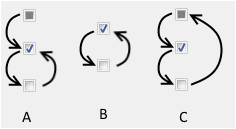
A) Mandatory check box with null attribute value.
A mandatory check box behaves as a two state check box. The exception is its initial state when no value has been set, in which the check box temporarily switches to the three state mode and its value is null. Once a value (True or False) has been set, the check box switches to the two state mode and the NULL value cannot be set any more.
B) Two state non-mandatory check box. Null is always displayed as false.
A non-mandatory two state check box with null value is displayed as 'False' but its internal value is null. Null is returned with the getValue() function.
C) Three state non-mandatory check box. Null is displayed as null (grayed-unchecked).
- Default Focus on this Field
Here it is possible to set if the field has a default focus when the View is opened.
- Select Action...
Click to open the Action browser and select the requested action. The action will be assigned and visible at the right edge of the attribute control. The action visibility is determined by the existing editor action assignments (state, mode, rules...).
Once assigned, you can edit the action using the Edit button or remove it using the Remove button.