|
|
|
|
|
On the Group Layout tab, the content and layout of the view are defined together with the attribute display of each control in the view.
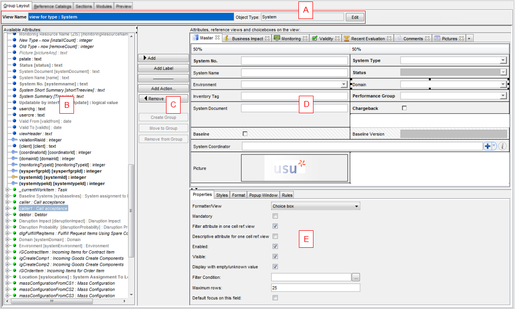
The Group Layout tab can be divided into the following sections:
- (A) General section
Here you can find some basic information about the view and make a few general settings.
- (B) Attribute resource section
Lists all available attributes for the related object type. You can select individual attributes for the View definition.
- (C) Control buttons
Using the appropriate buttons, you can move the selected attributes between the Attribute resource section and the View Designer. You can also add other elements such as a label, separator, action and manage groups.
- (D) View Designer
Here you can define the view by adding the individual view elements and design the overall view layout according to your requirements.
- (E) The 'Attribute Properties with Rules' section
Here you can set properties for individual tabs and view elements. For example, you can set a particular formatter of an attribute, define individual style and format for attributes, make specific settings for the view displayed in a popup window etc. You can also manage the existing View rules which apply to the view.