|
|
|
|
|
Table Tab
On the Table Tab, you can find the following items and make these settings affecting the Table output:
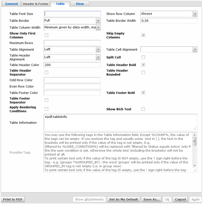
The Table Tab.
Element |
Function / Meaning |
Table Font Size |
The size of the text in the table. If not specified, the general font size will be used. |
Show Row Column |
If selected, the first column in the table will show the row number. |
Table Border |
This property defines whether a table should have a border or at least veritical or horizontal lines separating the columns or rows respectively. |
Table Border Width |
The width of the table border in points. |
Table Column Width |
The property defines how table column widths are determined. |
Show Only First Columns |
If selected, only the columns which fit within the page width will be shown. |
Skip Empty Columns |
If selected, all empty columns will be skipped so that they will not unnecessarily lengthen the table. |
Maximum Rows |
This property defines the maximum number of rows that should be shown in the table. If not specified, the table will show all rows - even if there are millions of them - but be aware that it may take a long time to show all rows of catalogs holding many objects and the resulting PDF may be huge! If specified and the limit is reached, the last row of the catalog will show ... in all columns to indicate this state. |
Table Alignment |
The horizontal alignment of the table. |
Table Cell Alignment |
The horizontal alignment of the values in the table cells. If not specified, the alignment will be the same as in the catalog (text aligned to the left, numbers to the right etc.). |
Table Header Alignment |
The horizontal alignment of the columns names in the table header. |
Table Header Color |
The background color of table header. If not specified, white color will be used. To specify a color, use the red,green,blue values 0-255 separated by a comma (e.g. 124,223, 34) or a single value 0-255 for a shade of gray. |
Table Header Bold |
If selected, the column names in the table header will be displayed in bold font. |
Table Header Separator |
If selected, the table header will be separated from the data rows by a horizontal line. |
Odd Row Color |
The background color of odd rows in the table. If not specified, white color will be used. To specify a color, use the red,green,blue values 0-255 separated by a comma (e.g. 124,223, 34) or a single value 0-255 for a shade of gray. |
Even Row Color |
The background color of even rows in the table. If not specified, white color will be used. To specify a color, use the red,green,blue values 0-255 separated by a comma (e.g. 124,223, 34) or a single value 0-255 for a shade of gray. |
Table Footer Color |
The background color of table footer (which shows aggregated values). If not specified, white color will be used. To specify a color, use the red,green,blue values 0-255 separated by a comma (e.g. 124,223, 34) or a single value 0-255 for a shade of gray. |
Table Footer Bold |
If selected, the aggregated values in the table footer will be displayed in bold font. |
Table Footer Separator |
If selected, the table footer will be separated from the data rows by the horizontal line. |
Apply Rendering Conditions |
If selected, rendering conditions defined in the catalog will be applied - i.e. each row might be rendered in a different style/color depending on whether the object matches the given rendering condition. Note that this option might increase the time to generate the PDF. |
Table Information |
Addition information shown before the table. It can contain special tags (see below). |
Show Rich Text |
If selected, the "rich text" attribute values will be rendered in the table in the corresponding style (bold, italic, font size...) including the embedded images. However, please note that this will make rendering long tables slower. |
Possible Tags |
The listed tags (text enclosed in %) can be used in the Table Information field. The tags will be replaced with the value as described next to the tag. |