|
|
|
|
|
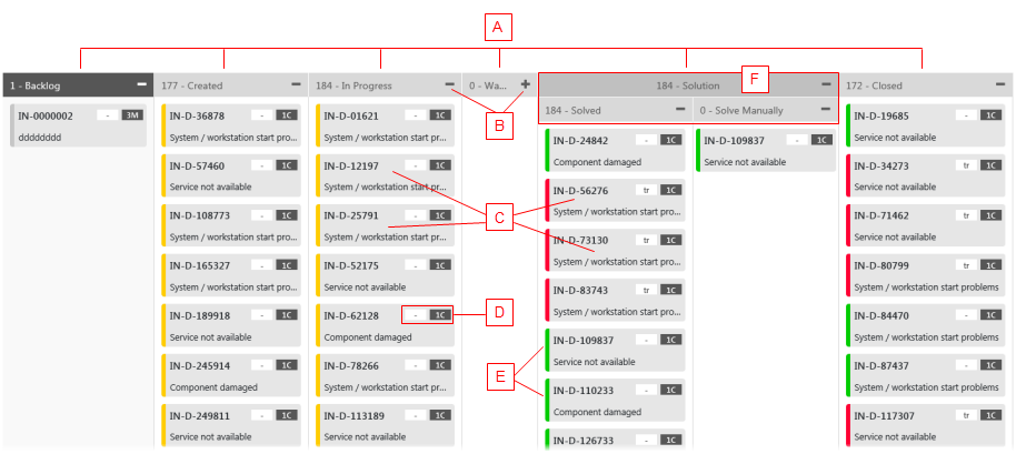
Kanban Board in Detail
|
The Kanban Board shows the following:
- (A) Columns
The individual columns which resemble the status value of an object. In this example, you can see that an Incident object can be in the Created, In Progress, Waiting, Solved and Closed position. Note that the name of column headers changes as you select a different Kanban board in the Kanban Board selector.
Each column groups the relevant cards by the status value.
- (B) Column width control
You can expand/collapse the individual columns using the +/- symbols in the column header.
By collapsing a column, you can minimize the board layout so that more columns will be visible without the need for scrolling. By expanding the columns, you can see all details in the cards at the expense of general overview.
- (C) Kanban Cards
The cards in columns resemble objects (Incidents or Activities). Each card displays a title with a basic description (an Incident number and the shorttext for Incident objects) and the badges (D) in the top right-hand corner. It is also color coded with a specific color (E).
Note: Use the Details button in the sidebar to see more details of a card.
- (D) Badges
The badges are quick shortcuts to specific attributes of the object in the card. For example, 2H badge means Priority 2, High. 4L means Priority 4, low. With the badges on cards, you do not need to go for full details of the object to see its priority or another attribute value as specified.
- (E) Rendered Colors
The cards deployed in the Kanban Board have a specific rendered color scheme which gives you a quick overview of the card status.
Please see also Sidebar.
- (F) Grouped Columns
The selected columns can be grouped under a grouping element with a specific name.